Frontier Merchant Capital Group
Rebranding
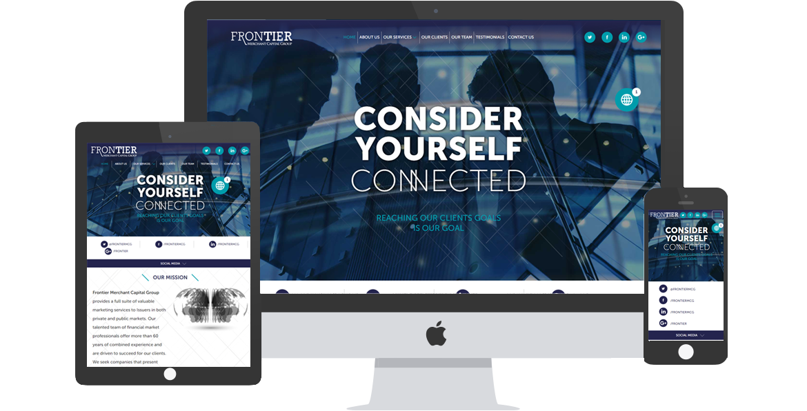
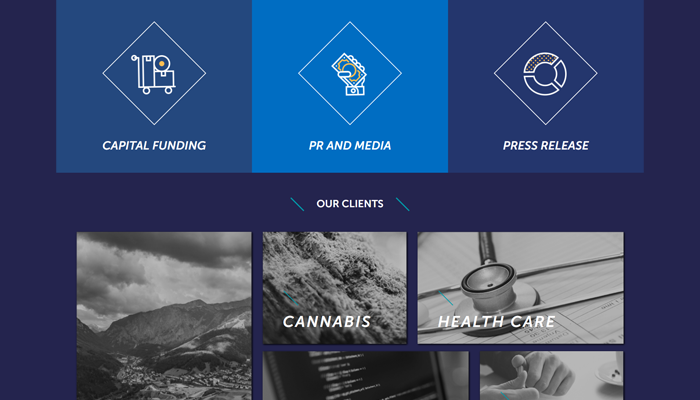
Frontier Merchant Capital had recently re-branded their new website to tell their success, company purpose and vision. The website they came to us with was outdated and not mobile friendly; information was difficult to find with multiple layers of navigation and design was inconsistent across varying pages on the website.
The Solution
With any financial company, finding information online, primarily through the company’s owned website, is integral to attracting investors. If potential clients are challenged in navigating through a website, they are much more likely to leave such a website and go elsewhere.
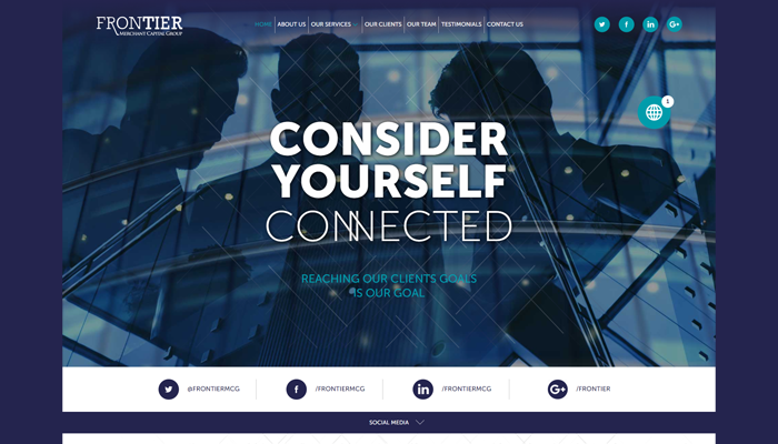
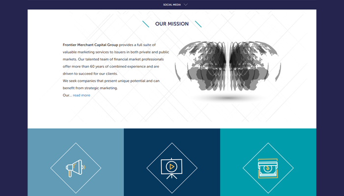
Bringing the website up to speed
When building a website, it’s important that the project goes smoothly and with efficiency in mind.From start to finish, we delivered a new website for Coeur in just three months, on-time and under budget.
Highlights
Making the website easy to access
Creating flowless experience for client
Start a Project
Every project is unique. From your website to digital marketing strategies to post-launch support, we personalize each element based on your goals, and aren’t happy until we’ve created digital solutions of the highest quality. You could say we’re addicted to producing best-in-class work.
Nasser Daher
Owner
Contact Us
Let's get some ideas going! Call us today.
Copyright TREK-IT INC. 2021 | All Rights Reserved
Have questions? We will get back to you shortly
I'll answer your questions


